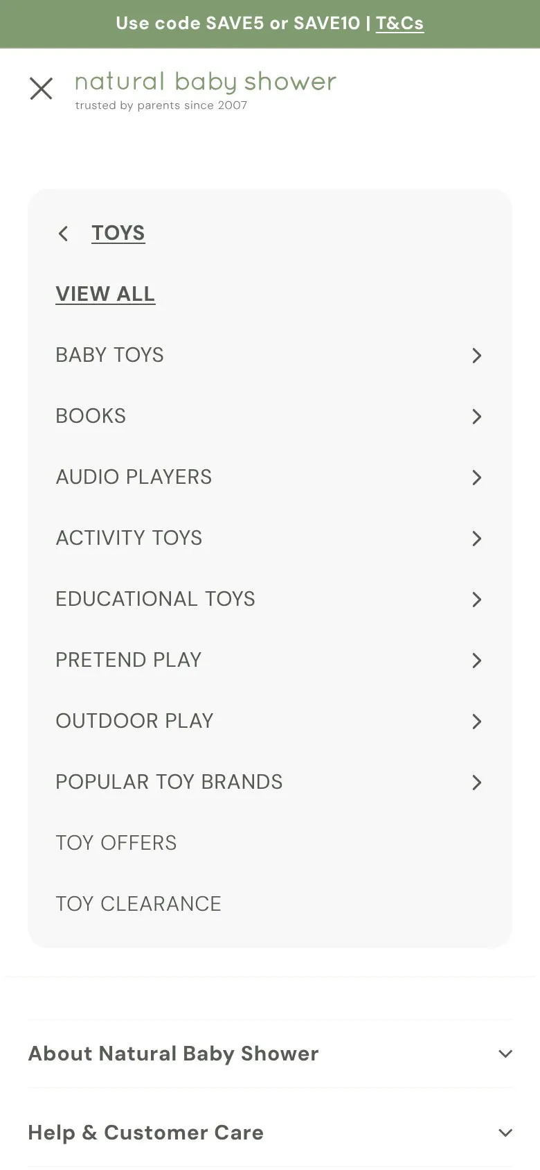
A big mega menu with a proper drill-down on phones
Natural Baby Shower Navigation
View live example 01
What they do
Hover over Toys and you get 45 links in columns. On a phone it turns into a drill-down with proper 44px rows.
02
Why it works
A big range needs a big menu, and columns let people jump straight to the right shelf. The phone version is done properly, with rows big enough to tap without hitting the one next to it.
03
Makes sense when
Big catalogues where people know roughly what they're after. Keep each column to the most-used links and let "View all" cover the rest.
04
Worth considering
On desktop each link is only 20px tall, and anything 820px wide or more gets that version, which covers most iPads. Rows nearer 32px, with slightly bigger text, would make it easier to tap.

Want this on your store?
I'll tell you which of these patterns will move organic revenue for your catalogue, and which to skip.
Book a discovery call